Double top
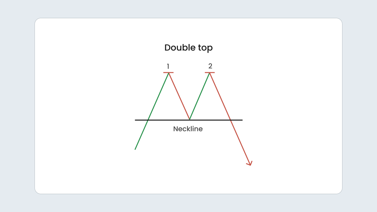
A double top pattern is the market’s way of showing it’s reached its limit. It forms when the price peaks twice with a small dip in between, creating an M-shaped chart pattern.
This is usually a bearish signal, meaning the price is likely to move lower than the support level that’s established at the low point between the two peaks. Just seeing the two peaks isn’t enough to make a solid trade decision, so it’s important to confirm this support level.
In this pattern, the market tries to push higher twice but falls short each time as sellers take over. Often, the second peak won’t quite match the height of the first, which suggests that the buying momentum is fading.
Double bottom
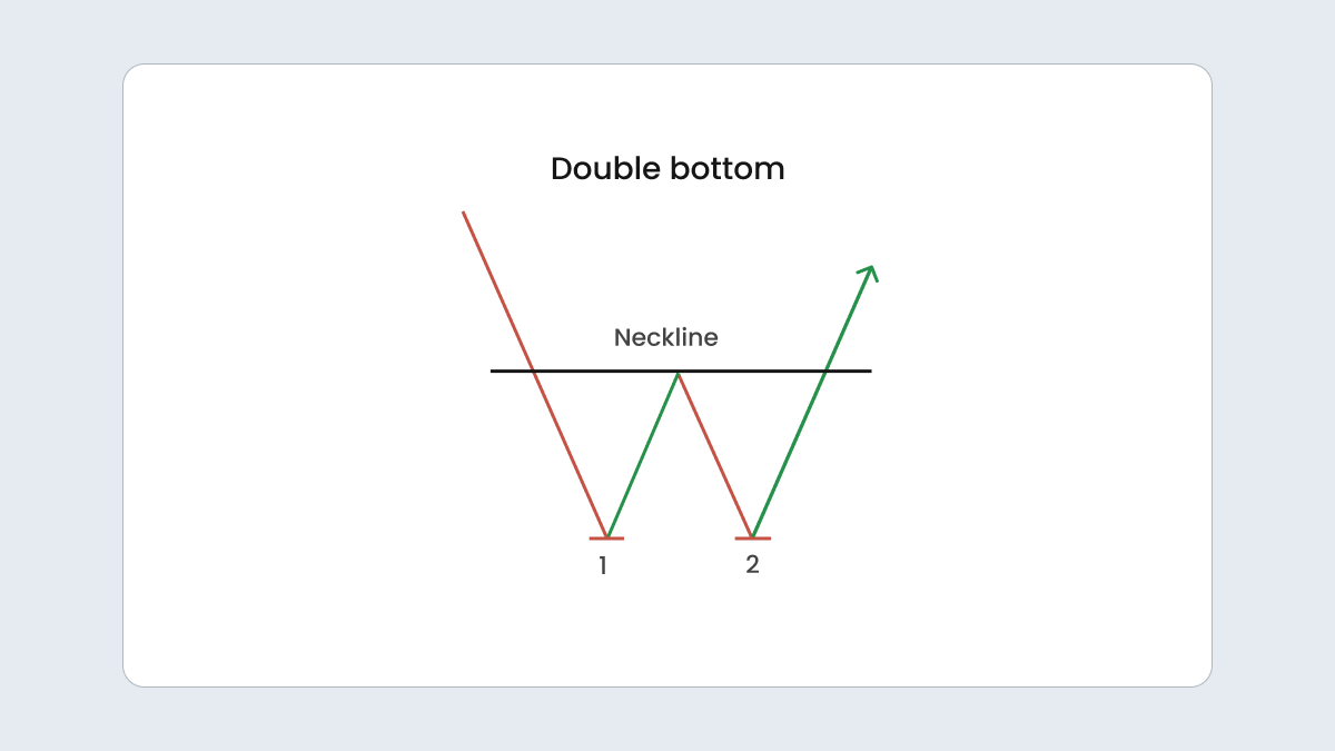
A double bottom is the flip side of a double top. It happens when the market price attempts to drop below a support level twice but fails both times. Between these attempts, the price temporarily rises to a resistance level, forming a W-shape on the chart.
This pattern is seen as a bullish reversal signal and suggests that selling pressure is easing and a new uptrend could be starting. So, if the price climbs past resistance, that’s a good indicator that the upward movement might continue. Here, as well as with the double top, it’s smart to confirm the resistance level before jumping into a trade through your chosen trading platform.
Head and shoulders
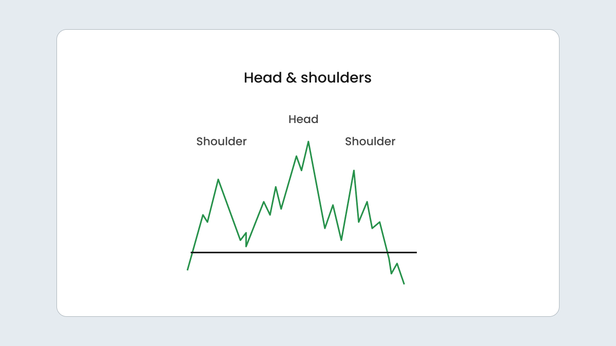
The head and shoulders pattern is a classic chart formation with a clear shape. There is a central peak, the tallest point, which is the head. On either side, there are two shorter peaks known as the shoulders. All three peaks tend to align with a support level called the neckline.
The pattern works like this: the market hits a high with the head, then pulls back before rising again to form the first shoulder. It dips again and rises for the second shoulder. But, unlike the previous highs, this third peak usually breaks through the neckline, signaling a shift towards a downtrend.
Essentially, the head and shoulders pattern suggests that the bullish momentum is fading. The market tried to push higher twice but failed to do so on the third attempt, which hints that it’s time for a downward move. This may be a good opportunity to seize the moment.
Rounded top or bottom
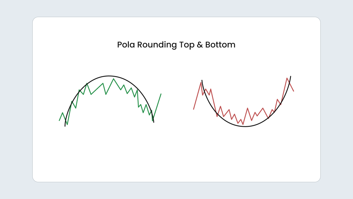
A rounded top, which looks like an upside-down U, suggests that the market is gearing up for a decline. On the other hand, a rounded bottom, shaped like a U, indicates that an upward trend might be approaching. Unlike the quick moves seen in double tops and bottoms, rounded patterns unfold more slowly, over a series of sessions.
In a rounded top, the market starts strong with higher highs but gradually starts to flatten and then decline, showing that selling pressure is increasing. A rounded bottom starts with less buying momentum. As the pattern forms, buying interest grows and pushes the market higher, hinting at a potential rise.
Cup and handle
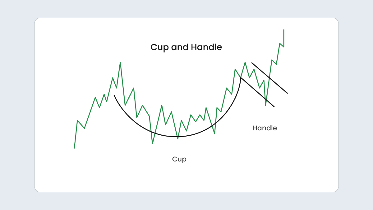
The cup-and-handle pattern looks like a rounded bottom with a bit of a twist. It starts with a deep, rounded dip, followed immediately by a smaller, secondary dip. It’s similar to a double bottom with a little extra step, delaying the rise but not stopping it.
This pattern reveals a potential upward reversal. It indicates that after a bit of sideways action, the market is poised to move upward.
How to trade with patterns
The main principle is simple: you buy in bullish setups and sell in bearish ones. But remember that whether it’s a simple or advanced chart pattern, no pattern is perfect,, so managing risk is key.
Here’s how you should approach pattern trading:
Confirming a pattern
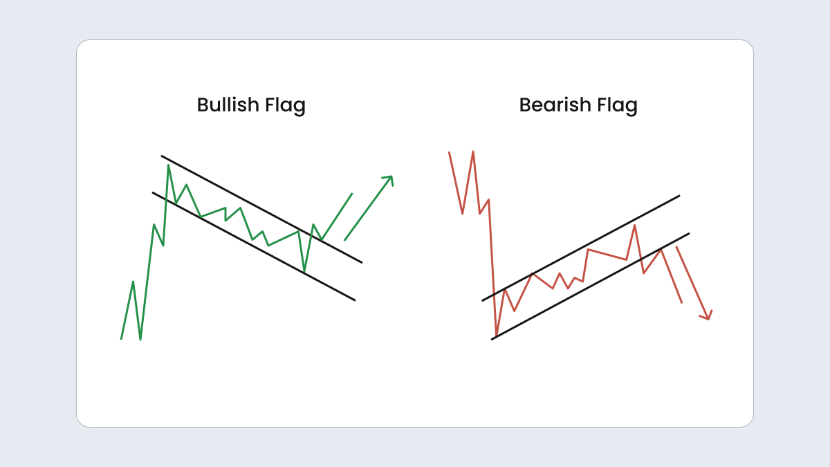
Don’t jump in right away. Wait and see if the pattern holds. If you spot a bullish flag, for instance, wait for a couple of green candles after the breakout to confirm the trend. Sure, you might miss a few points, but it’s better than taking a loss if the pattern fails.
If you need more assurance, check past price levels or use momentum indicators for extra confirmation.
Setting your stop-loss
Always protect yourself with a stop-loss. That way, you won’t lose too much if things go south.
- For bearish patterns, set the order above the last high.
- For bullish ones, place it below the last low.
For example, in a bull flag, set your stop-loss just below the support line to limit your risk.
Choosing a profit target
Know when to cash out. Determine a profit target according to the pattern’s dimensions. If your bull flag has a 50-point range, aim for a 50-point gain above the breakout.
This also helps you figure out your risk-reward ratio. If your stop loss is 25 points below, you’ve got a solid 1:2 ratio — a good balance for most traders.
Table of trading chart patterns in summary
|
Pattern
|
Description
|
Trend
|
Signal
|
Characteristics
|
|
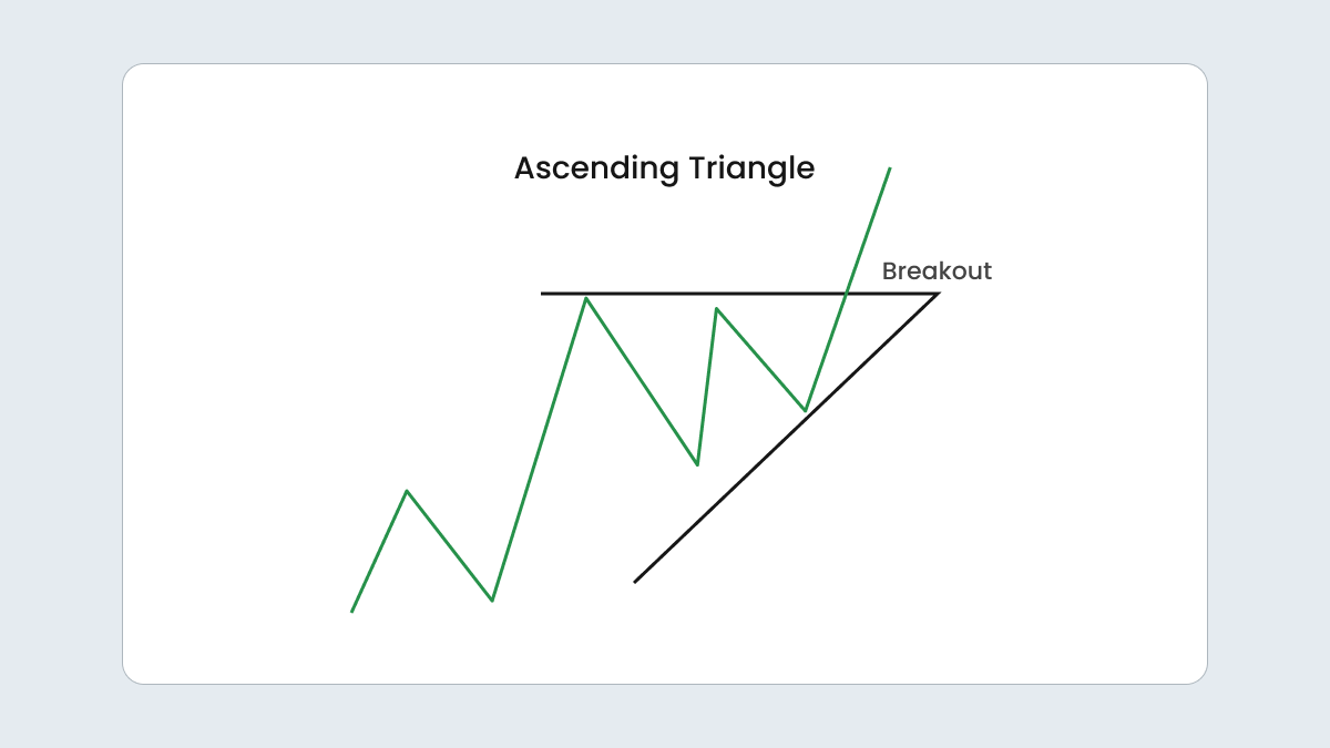
Ascending triangle
|
Highs stay the same while lows rise
|
Uptrend
|
Bullish continuation
|
Price consolidates, then breaks above resistance
|
|
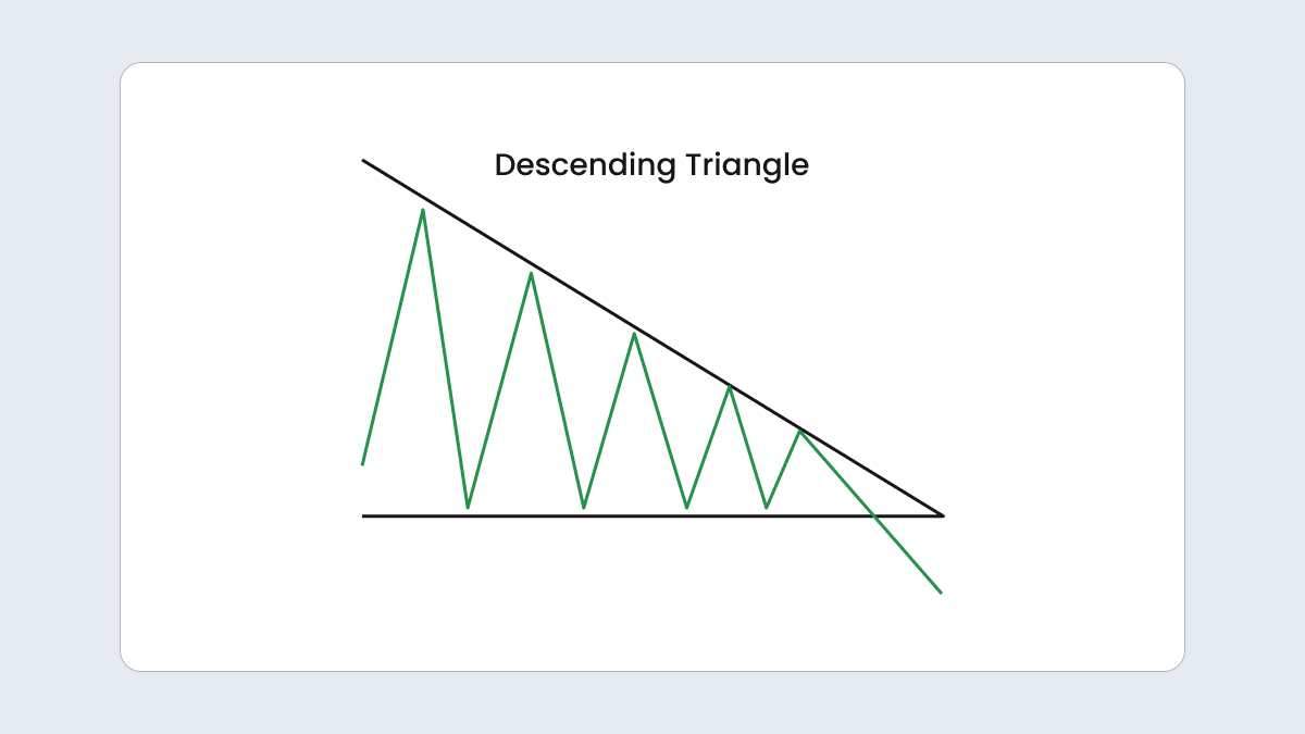
Descending triangle
|
Lows stay the same while highs fall
|
Downtrend
|
Bearish continuation
|
Price consolidates, then breaks below support
|
|
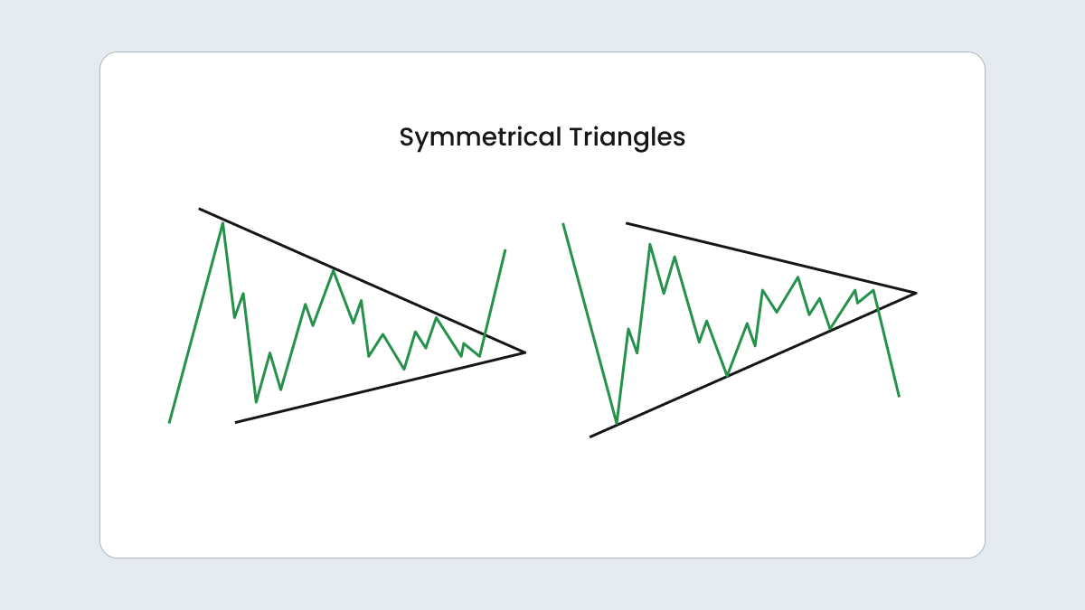
Symmetrical triangle
|
Trendlines converge, a narrowing pattern
|
Either
|
Can be bullish or bearish
|
Price breaks out in either direction
|
|
Flag
|
Parallel trendlines with a brief consolidation
|
Depends on prior trend
|
Continuation (bullish or bearish)
|
Price consolidates before resuming in the direction of the previous trend
|
|
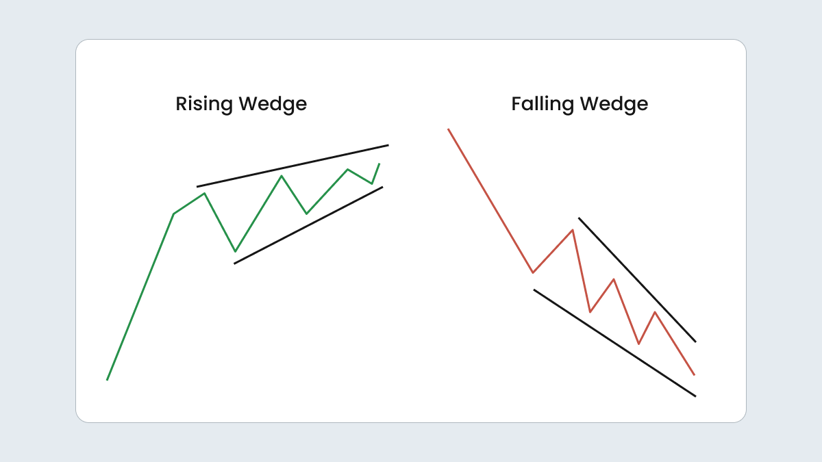
Wedge
|
Converging trendlines that narrow over time
|
Depends on type
|
Can be bullish or bearish
|
Rising wedge = a bearish breakout; falling wedge = a bullish breakout
|
|
Double top
|
Two peaks with a dip in between
|
Downtrend
|
Bearish reversal
|
A trend reversal after a peak
|
|
Double bottom
|
Two troughs with a peak in between
|
Uptrend
|
Bullish reversal
|
A trend reversal after a trough
|
|
Head and shoulders
|
A high peak in the middle with two lower peaks on either side
|
Downtrend
|
Bearish reversal
|
Weakening bullish momentum and a potential market trend reversal
|
|
Rounded top
|
Gradual peak in the shape of a curve
|
Downtrend
|
Bearish reversal
|
A slow shift from upward to downward movement
|
|
Rounded bottom
|
Gradual trough in the shape of a curve
|
Uptrend
|
Bullish reversal
|
A slow shift from downward to upward movement
|
|
Cup and handle
|
A rounded bottom followed by a smaller dip and then a rise
|
Uptrend
|
Bullish reversal
|
Cup indicates consolidation, with a handle forming a brief pullback before breaking to new highs
|
FAQ
How many different types of chart patterns are there?
The answer depends on who you ask. Some people say there are just three types that correspond to how the price moves — continuing, reversing, or consolidating. Others might count over 70 different patterns, each with its own unique twists and nuances.
Which chart pattern is the most reliable?
It really comes down to what works best for you personally. A chart pattern can work for one trader and not work for another, so finding the pattern that aligns with your unique strategy is key.
What are the kinds of graph patterns?
In technical analysis, charts generally fall into three graph patterns. Continuation patterns imply that the current trend is expected to continue after a short break. Reversal patterns represent a trend changing direction. Lastly, bilateral patterns signal that the market could move in either direction due to increased volatility.
What do chart patterns represent?
Chart patterns are visual representations of past price movements on a trading chart. They help identify recurring trends and shapes and give traders insights into potential future price behavior.